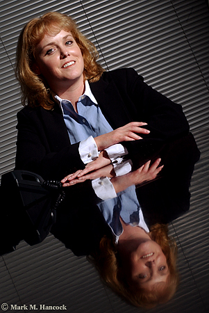
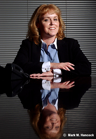
Heather Ainsworth, division director of Robert Half Finance and Accounting, poses for a portrait at her office in Dallas on Monday, November 22, 2004. She manages a group which specializes in full-time placement of accounting professionals.
Photos © Mark M. Hancock and The Dallas Morning News
These are images from a tough situation. I could only shoot in their conference room. Compositionally, it's further complicated by having only one subject.
I tried to make the image more interesting. I snooted the light, I used her reflection on the polished wood table and I even tilted the frame. The non-tilted image ran as expected.
I'll admit a tilted view makes a boring image more interesting. There's the problem. Tilting a view is controversial to PJs because it makes a boring image more interesting.
The general composition rule is horizontal lines are horizontal and vertical lines are vertical because this is the way people see. Leading lines can be diagonal because they imply distance.
For those who tilt frames (deliberately turn the camera to violate the compositional norm), the rule is abstract and artificial. The rule can be considered a nuisance or an outright affront to creative expression.
For traditionalists, tilting frames is sloppy and unprofessional.
For most working PJs, it just happens. At other times, it's a tool to keep in the bag for when it's warranted. Sometimes it works, sometimes it's sloppy. Each image dictates its applicability.
To tilt
Most PJs have it hammered into our heads to make any situation visual or don't bother coming back to the newsroom. It's the PJ's job to sift through the scene and locate the single interesting image. When there is absolutely nothing – an extremely rare occurrence - a tilt may be warranted.
On equally rare occurrences, a tilt could be the only way to keep all visual elements within a frame. In these circumstances, the only other way to keep all the elements is to back up too far and include too much extraneous information that the image is degraded.
Lastly, the most legitimate use of a tilt is chaos. The PJ is running to or from something horrible and the camera was tilted due to other actions of the PJ. It's not a deliberate tilt as much as the PJ is darn lucky there are any useful frames at all.
No tilt
The strongest argument of the no-tilt camp is sloppiness or lack of creativity on the part of the PJ. If the PJ didn't work the situation hard enough, they may have simply tilted because it was an easy or faster way out of a situation.
In the viewfinder of most decent cameras are lines. These are normally part of the ground glass and vary from a single straight line with serifs to a complete grid. Many modern cameras allow the ground glass to be replaced with either preference.
While viewing the scene, PJs can align these guides to known standard bases to set the orientation and alignment of the frame.
To double check the tilt, most decent tripod heads have integrated bubble levels. I wouldn't suggest limiting the composition to where the bubble aligns, but it's a tool to use when the scene itself is somewhat askew.
Reasonable rule
Personally, my predilection is toward the no-tilt side. However, I understand compositional rules are meant to be broken at the right time with the right knowledge. A reasonable composition rule maximizes the use of the frame.
Locate one item within the frame to justify the vertical or horizontal pitch. As an example, it's relatively acceptable to match the frame tilt with a particular spoke of a bicycle tire or tree branch. Although the remainder of the frame is “tilted,” there is a defined “base” for the tilt.
Along this same line, when shooting ultra-tight, a tilt maximizes the frame by keeping the subject's main facial features within the frame while cropping the remainder. However, I'd still suggest some traditional frames before returning to the newsroom. If the tilted frame is interesting enough, an editor might be convinced with logical evidence to use it.
How to align in PS
There are two ways to align images in Photoshop. The measure tool method is easiest and most reliable. The crop box method is often required when multiple angles and/or a wide-angle lens are at play. Although it isn't as exact, it often looks better because the PJ determines what looks correct considering all the variables.
Measure tool method
As stated, this is the most exact method to align an image. It's often the easiest method when longer lenses are used because angles have less curvature.
While the file is open, move the mouse over the eyedropper tool. Click and hold the mouse until the alternative tools appear. Select the measure tool (it looks like a ruler).
Chose a straight line (vert or horizontal) within the image to use as a plane base. A longer line leads to a more accurate rotation. Move the cursor to one end of the line. Depress the mouse button and move the mouse to stretch the line across the entire length of the plane base. Release the mouse
To adjust the line, use the mouse to grab and move the plus symbols on the ends of the line.
Once a straight line is produced in the appropriate place, it's time to rotate the image. Go to "Image" and select "Rotate Canvas" then select "Arbitrary..." When the dialog box appears, it'll be set for the accurate angle rotation and direction. Hit "OK."
The image should now appear straight as set by the plane base. If not, "Undo" the rotation and try again until it appears visually correct. With ultra-wide images, very few things are going to be "straight" due to barrel distortion. As long as the crop line intersects a curve at an equal distance to maintain symmetry, it's close enough.
Next, crop the excess (background colored areas) from the image. The image is smaller, but it is properly aligned.
Crop box method
Because many tilts are accidental and only slightly off level, it might be best to align the frame in Photoshop before the final edit. The process is easy.
While the file is open, create a crop box. Stretch the crop edge along a chosen line (vert or horizontal). A longer line leads to a more accurate crop. Move the cursor outside the crop box until it makes a curved symbol. Depress the mouse button and move the mouse to rotate the crop box until the edge aligns with the chosen base line. Release the mouse button.
Next, stretch the crop box edges until they form a good crop while remaining completely within the image area. Move the cursor within the crop box and double-click to set the crop.
The image should now appear straight as set by the base element. If not, “Undo” the crop and try again until it appears visually correct. With ultra-wide images, very few things are going to be “straight” due to barrel distortion. As long as the crop line intersects a curve at an equal distance to maintain symmetry, it's close enough.
A Leeson lesson on tilts
David Leeson is known to tilt some frames. He wanted to voice his view on this subject as well.
The issue is to get your mind off it. It’s not about whether you tilt or don’t tilt. For me personally, it’s simply shooting in a way that communicates most effectively. With that said, I think people use tilting as a gimmick.Enough for now,
It’s so obvious they simply tilted the image because it makes it look cooler. I have a bigger pet peeve than that. I have a much bigger one and that’s people who put those really cool little black borders around all their stuff. These are digital images and they’re putting them like it’s a film edge. It almost always makes the image look cooler.
I just don't like gimmicks.
I've been guilty of it myself many times – using a gimmick. But I hate it whenever even I do it. I despise it. I look at myself and say, 'That's disgusting. Why'd you even do that?'
It's because you didn't want to give it the extra effort or you were completely, flat-out busted and couldn't think of anything else. You just didn't know what to do. You're stuck. It's a lack of confidence.
It's not knowing how to follow a story. You just didn't approach it right.
Think of some of the world's greatest images and then think about if they would be better if you tilted them. We don't do that. Do we?
On the other hand, think of some of the world's greatest images that are tilted. You'll find out when you look at those, they're not tilted because someone wanted to use a gimmick. They're tilted for a purpose or reason. Maybe it's because the photographer was running like hell. Maybe it's a grab shot. The whole point was that it was supposed to be from the hip, and it's supposed to have that kind of feeling. In other words, the photographer isn't even thinking about whether they were tilting or not.
A lot of the tilts that you see in my images, I'm not purposely tilted. I don't even notice it because I'm shooting quick. I shoot from the hip a lot.
I used to challenge young photographers to try sometimes on an assignment instead of seeing the image, try to feel the image. Try to shoot by what you feel, not what you see. Get rid of what you see. Practice actually experiencing the feeling of that situation.
A lot of times when I was doing that, I wasn't even looking through the camera. Obviously, it wasn't always straight either because I'm not lining it up.
I don't really think about it myself. I have some tilts. Sometimes I don't. I don't really know. But, I do not ever knowingly say, 'This would look cooler tilted.' I just don't do that. I don't even think about it.
If you look at Eugene Richards, his stuff is tilted like crazy. Now, he's an amazing photographer, no one is going to question the brilliance of Eugene Richards. Yet, so much of his work is tilted.
But if you really study those images, you'll see that it's tilted for a purpose. Look at what he included in the frame. Those tilts have a purpose behind them. I promise you, go and look at that work. It’s absolutely amazing because you can see how the tilted frame included some detail in the frame – additional content perhaps – that helped make the image.
The only way he could have got it in there using the lens length that he was using would be to tilt it. You'll see it. So it's not a gimmick.


No comments:
Post a Comment